Reread
We enriched Reread's cultural presence, connecting them deeply with their audience and amplifying their impact.
A mother of two in Sydney reached out to us with a quiet but powerful question: “How do you build a culture of rereading?” In homes across the city, piles of unread books gather dust or end up in donation bins with no real system for reuse. What if there were a way to recirculate children’s books in a way that felt joyful, intentional, and sustainable? Reread was born out of this idea, a grassroots initiative to give preloved books new life, while starting conversations with children about care, sharing, and the future.
The Brief
To create a brand identity and experience that nurtures a culture of rereading—one that feels imaginative, inclusive, and rooted in circularity. The goal was to go beyond visual design and shape a system that encourages care, sharing, and storytelling across generations.
The Challenge
This wasn’t just about creating a brand. It was about building a system where none existed. How do you shape communication for something that doesn’t yet have a reference point? How do you design a cultural behaviour—one that encourages children and parents to see the value in passing stories on?

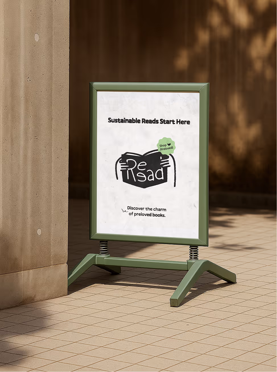
Our Approach
We knew this wasn’t just about logos or colours. It was about shaping a mindset. A way of living with stories. We rooted the brand in imagination, circularity, and care—qualities that resonate with children and adults alike.
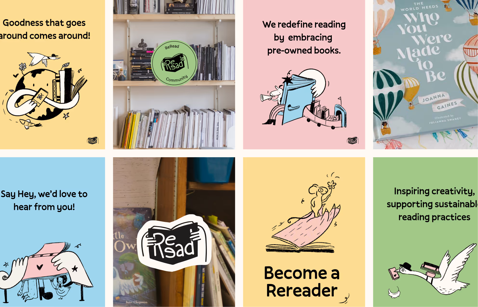
Visual Identity
Inspired by beloved children’s books, the visual language feels hand-drawn, textured, and whimsical—like the stories themselves. Each illustration invites you into a world where books grow on trees, travel between homes, and carry memories from one reader to the next.
Impact
Reread isn’t just a reading initiative. It’s the beginning of a ripple—where books live longer, children think wider, and communities grow closer. Because the stories we share shape the future we create.
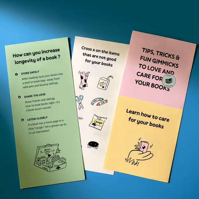
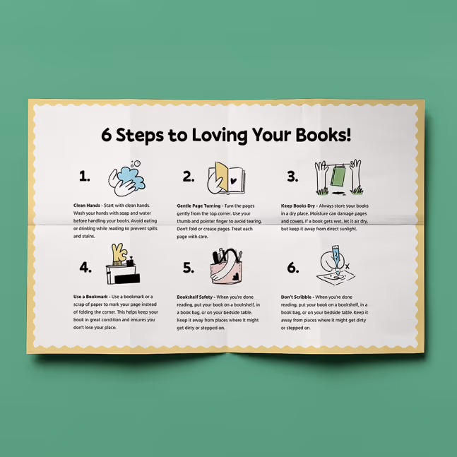
Designing for Circularity
To extend the life of each book, we introduced a Book Care Guide—a foldout printed piece that teaches kids how to care for their books, log their names as readers, and feel part of a story’s journey. We also created a Lifecycle Map—a visual that traces a book’s journey from paper to shelf to new reader. It’s a reminder that stories can be passed on, not discarded.